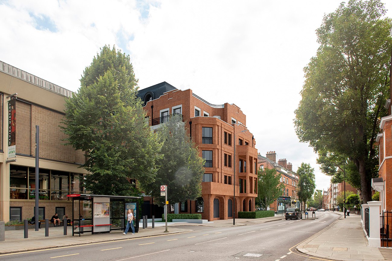
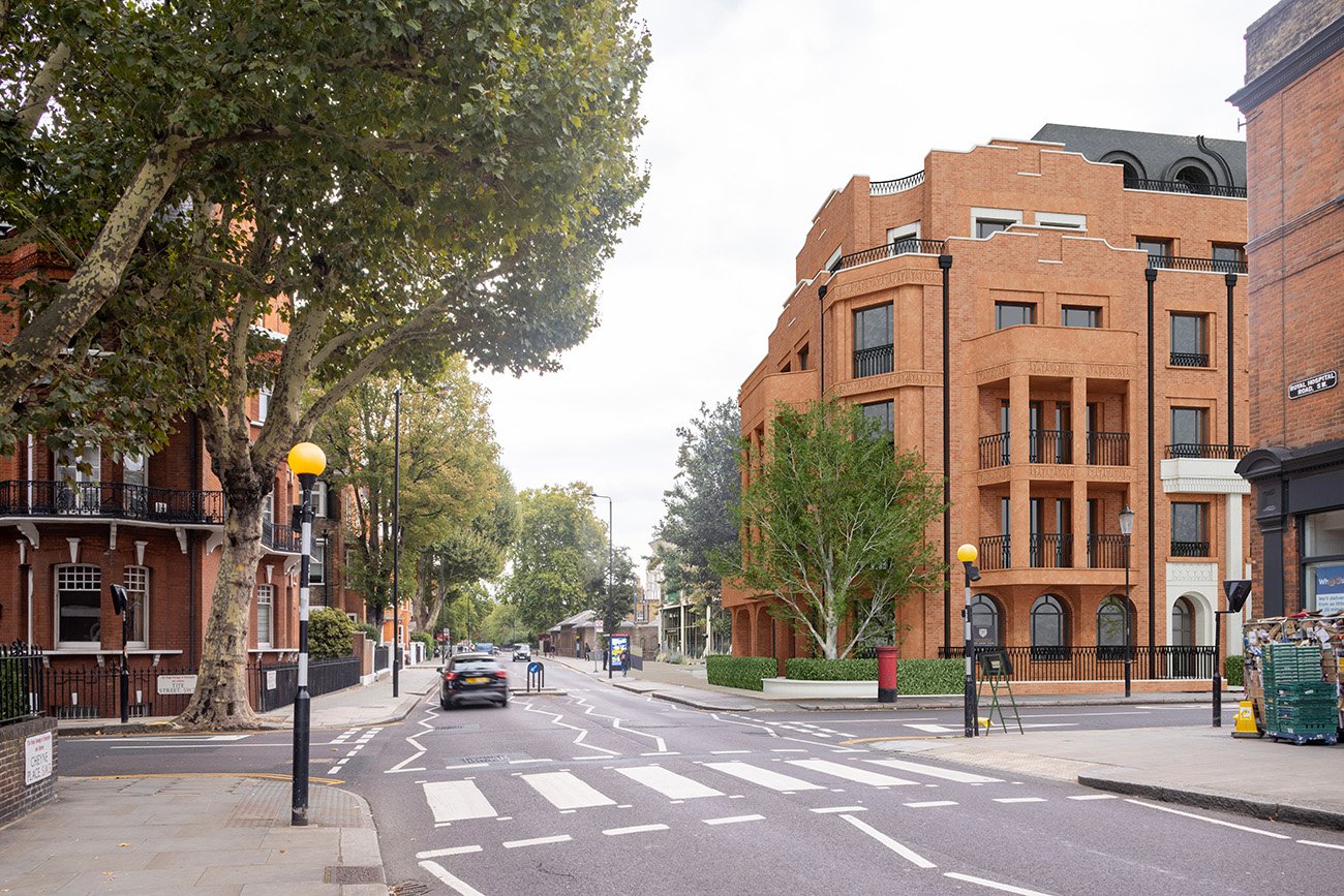
A Better Fit for Tite Street
Re-thinking London Square's Approach to Height and Mass
We’ve had a go at addressing height & mass for St Wilfrid’s Convent ourselves – just to show that with a lighter touch and a bit of common sense, you can get something that fits, delivers homes, and feels right for Tite Street.
This tries to fix two of the big problems – height and mass, not the other issues raised in our planning objection – which remain real problems for London Square.
In a nutshell, we have reduced the height by one floor across the main building and by two floors on the southern townhouse-style section and have broadly retained the northern and southern townscape gaps. We think that by modestly adjusting unit sizes, London Square would be able to get roughly the same number of homes.
St Wilfrid’s Convent is hardly an architectural treasure – we certainly have no objection to its replacement. In fact, our plans are still nearly three times larger than the current building (London Square’s are four times larger). But as we haven’t overpaid for the site, unlike London Square, we can do something that truly respects the Royal Hospital Conservation Area – restoring balance, good proportions, and a sense of neighbourliness to this remarkable street.
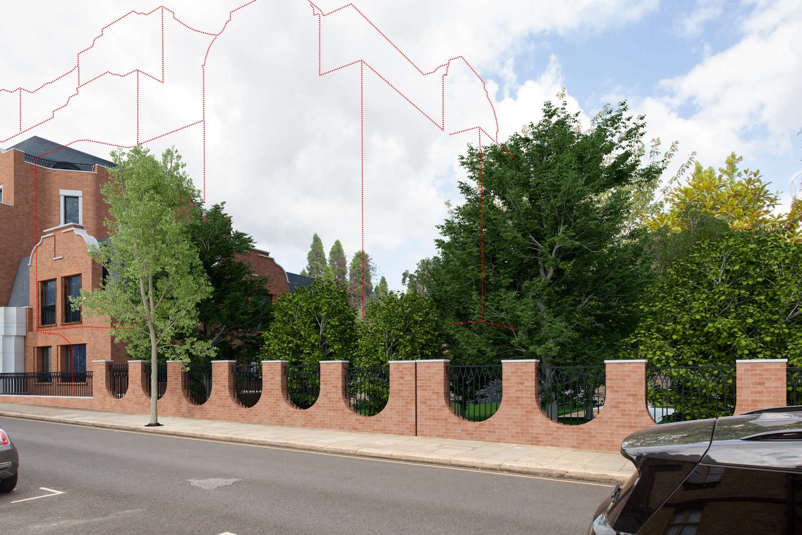
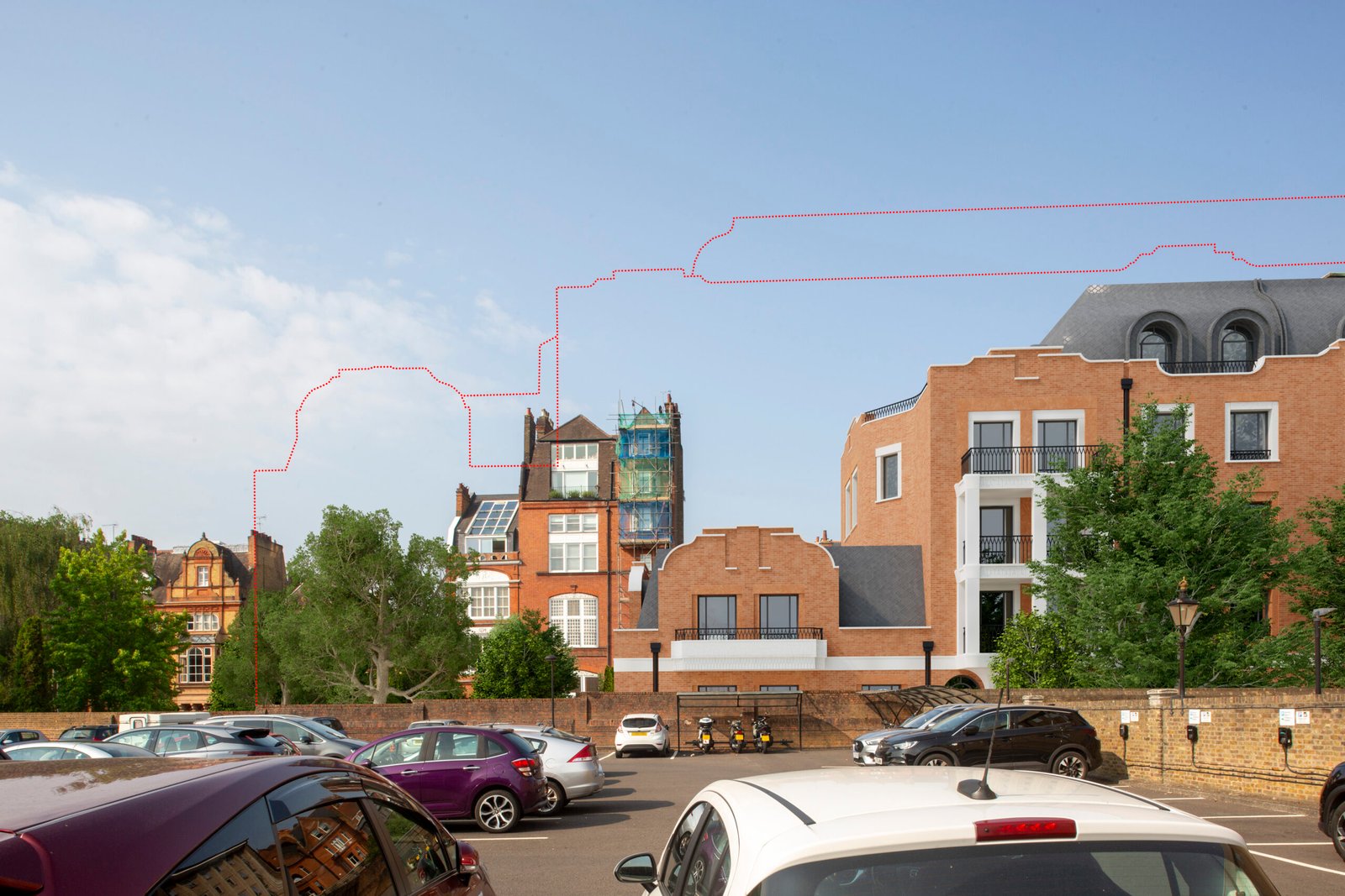
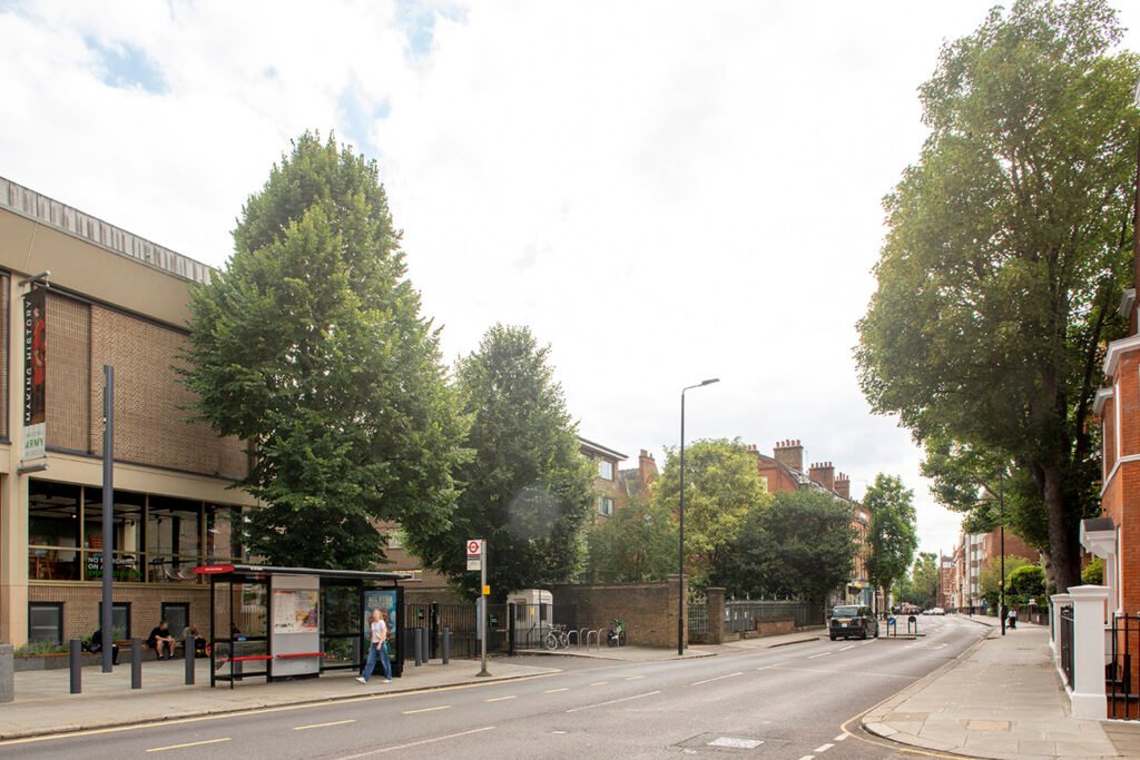
Tite Street Looking North
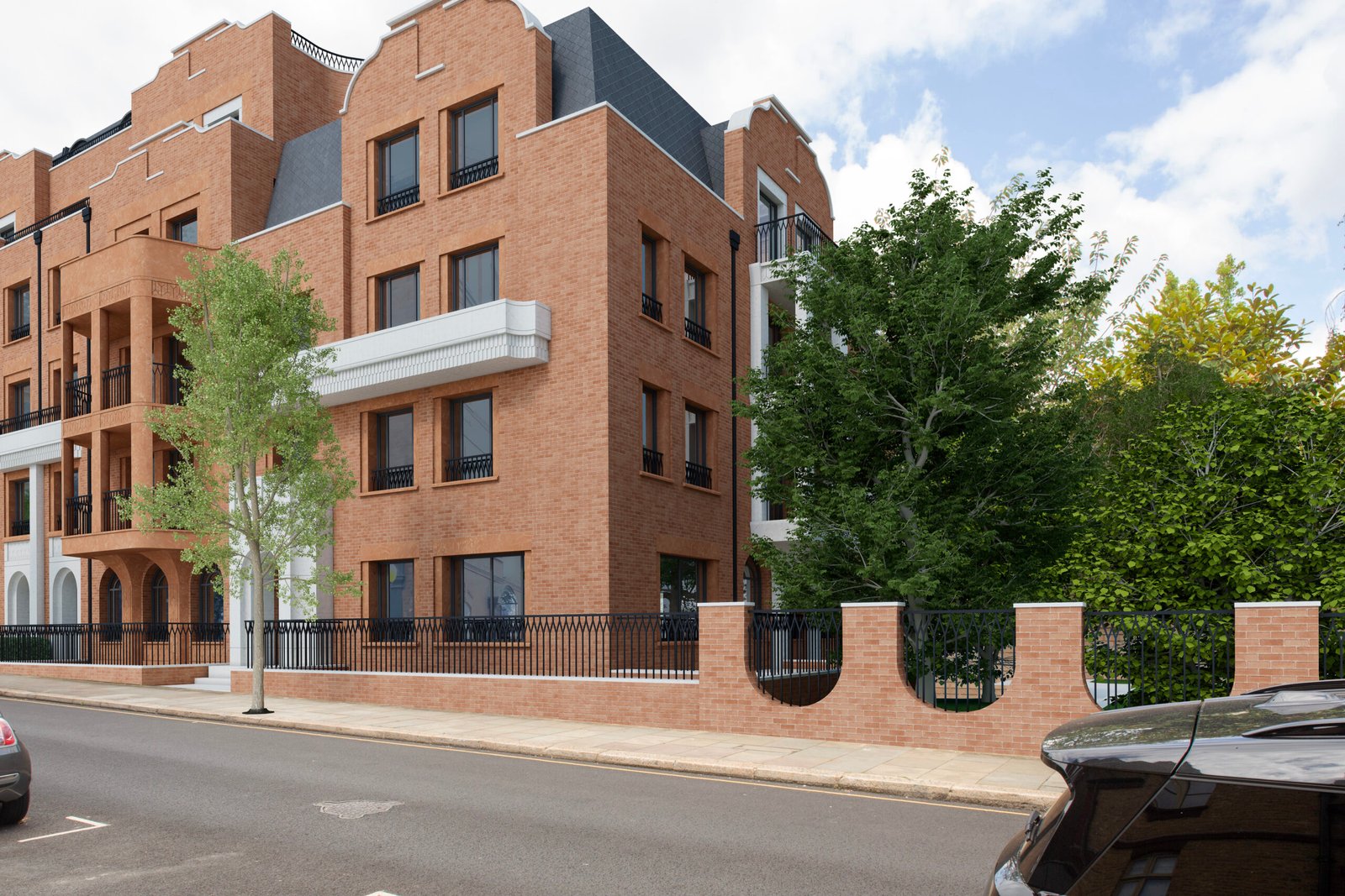
View north along Tite Street showing how London Square’s proposal closes the townscape gap, while our alternative restores openness and balance.
View north along Tite Street showing how London Square’s proposal closes the townscape gap, while a different approach restores openness and balance.
This view captures the southern townscape gap – the breathing space that gives Tite Street its rhythm and light. London Square’s scheme drives over it, to get back what they have overpaid for the site rather than to fit the place. A more modest, respectful design – as shown – could still deliver homes while preserving the vital gaps that the Conservation Area Appraisal identifies as integral to the area’s character.
Royal Hospital View Looking West
View west from the Royal Hospital car park showing London Square’s overbearing height versus the lighter, more open approach.
Taken from the Royal Hospital car park, this image shows the true scale of London Square’s proposal – a looming wall that materially obliterates the southern townscape gap and breaches the 21-metre height limit. The alternative restores that space and lets the trees and sky breathe again, returning a sense of proportion to this corner of Chelsea.
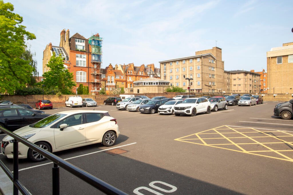
Royal Hospital Panorama
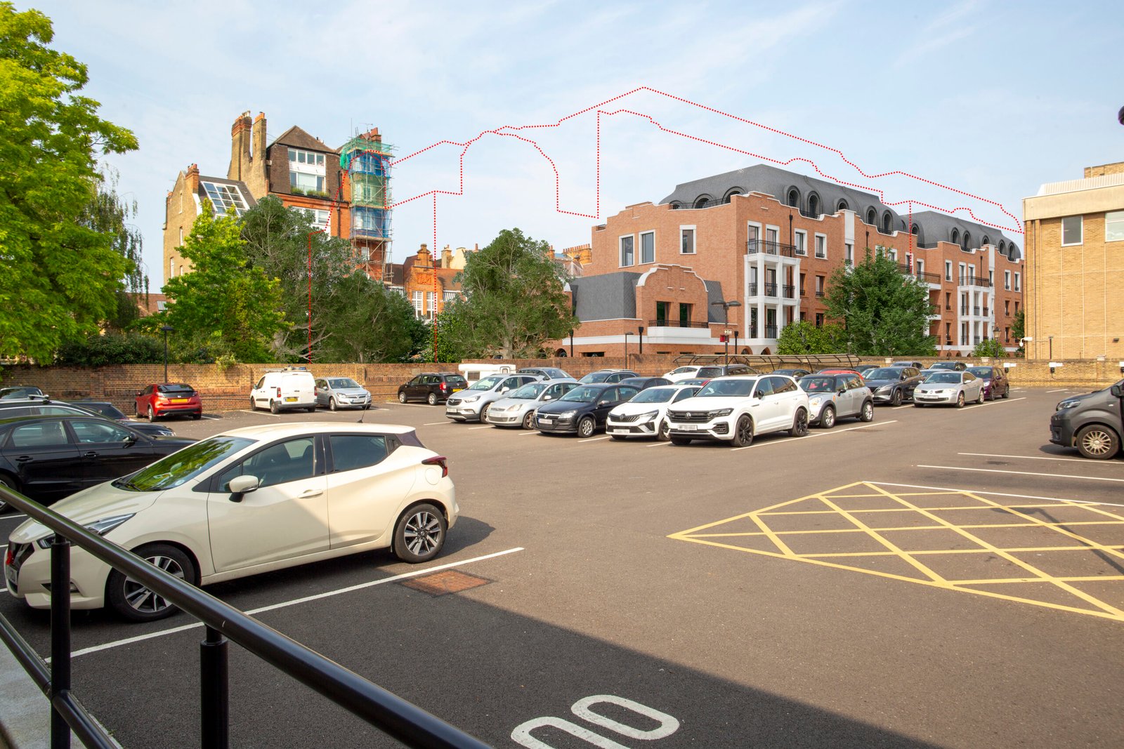
Panoramic view from the Royal Hospital grounds showing the material loss of the townscape gap under London Square’s proposal and its restoration in the modified version.
From within the Royal Hospital grounds, the difference in tone and scale is plain. London Square’s massing reads as an unbroken slab, closing the southern townscape gap. The alternative reinstates that vital space – maintaining visual relief and a human scale consistent with the surrounding listed buildings and gardens.
Royal Hospital Road – Looking South-West
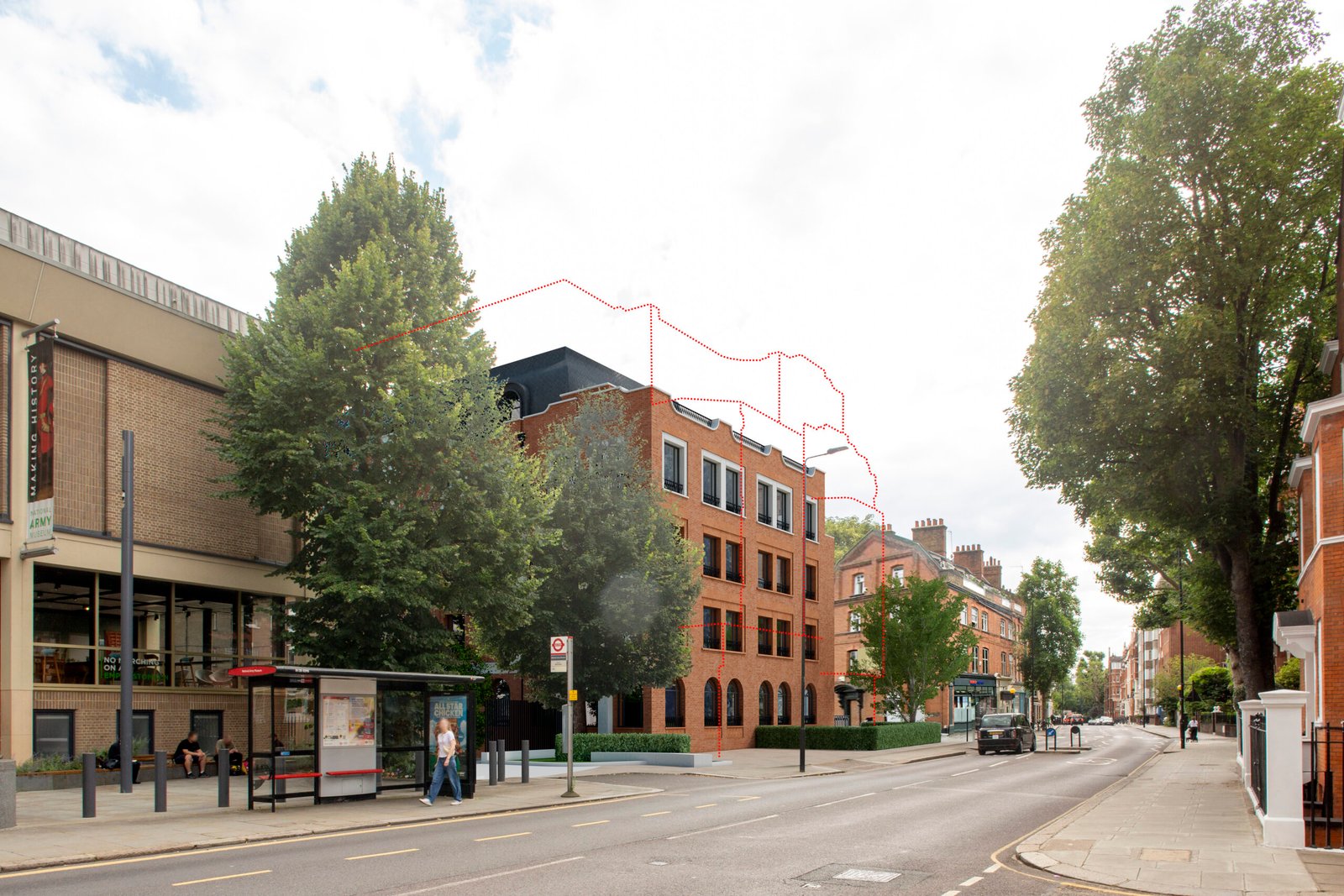
View looking south-west on Royal Hospital Road showing London Square’s encroachment into the protected gap versus the setback, lower-rise option.
From opposite the National Army Museum, the London Square design pushes forward with a heavy five-storey block and dark roof structure, erasing yet another protected townscape gap. The alternative pulls the building line back to align with the museum’s frontage – restoring the sense of openness that defines Royal Hospital Road.
Royal Hospital Road – Looking North-East
View looking north-east on Royal Hospital Road showing London Square’s enclosed frontage versus an open, balanced alternative.
From the opposite direction, the same problem is clear: London Square’s design closes the view corridor and darkens the street. The alternative is to open it back up, allowing trees, light, and sky to return to the composition – a modest correction that restores dignity to the street.
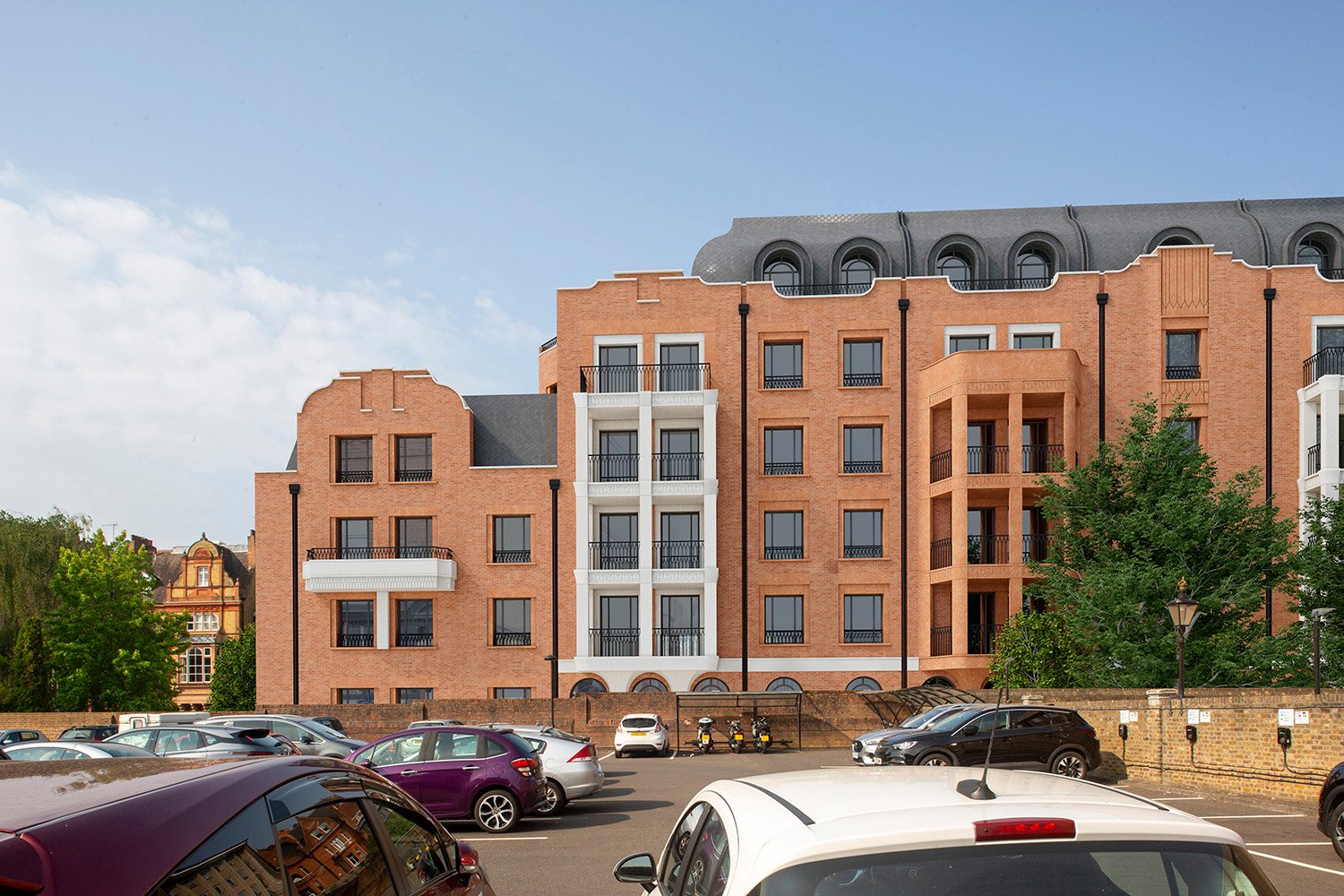
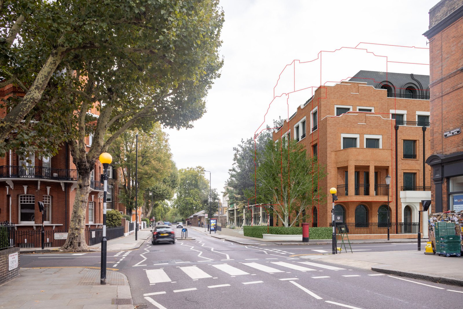
Tite Street West Elevation Comparison
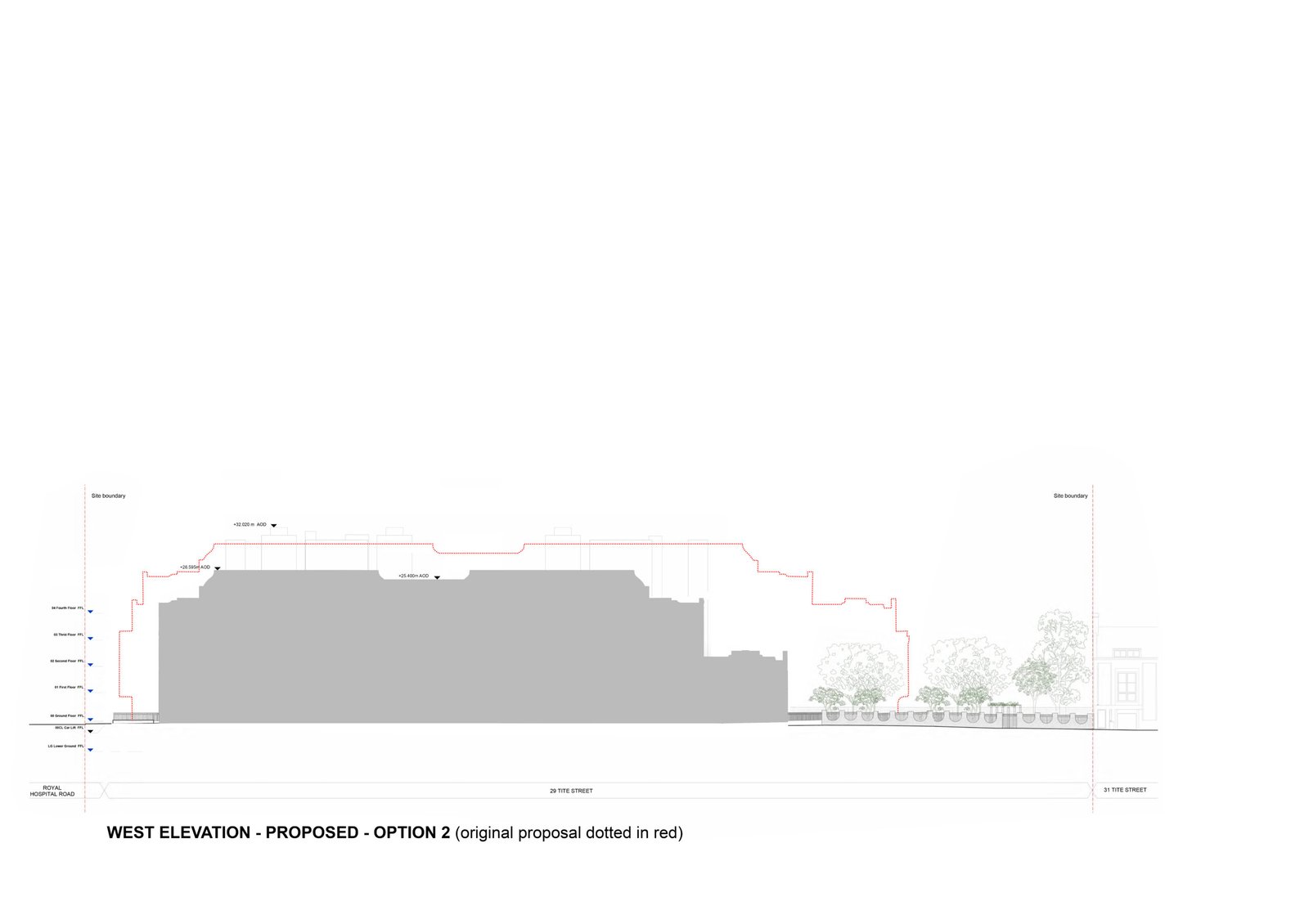
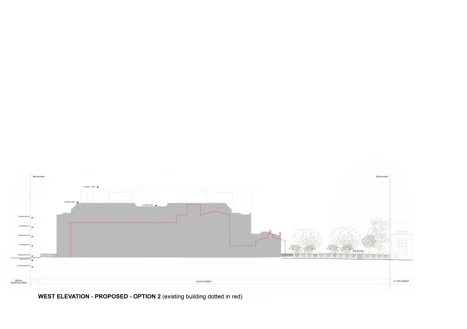
West elevation comparison showing the reduced-height and length version against London Square’s taller and longer scheme and the existing building.
This comparison shows how a simple reduction in height and mass restores balance to Tite Street. You can see here how a different approach for the site compares to what is there today – and what London Square propose.
St Wilfrid’s Convent is no architectural gem and replacing it makes sense. But by lowering one storey throughout, and two at the southern end, and broadly restoring the townscape gaps, a different version sits comfortably within the established roofline and scale of Tite Street rather than overwhelming it – a design that shows care, proportion, and perhaps a touch of the old Chelsea good sense that the city could do with more of.